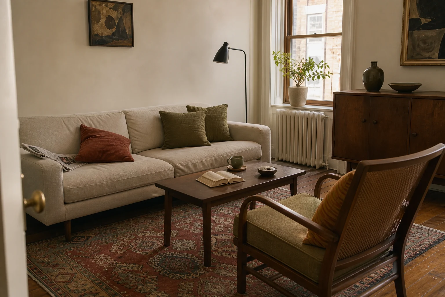
The easiest colour palette to live with often begins with something you already love. A faded rug, painting, patterned cushion, ceramic bowl or length of fabric has already solved a difficult problem: its colours coexist in proportions that caught your attention.
Your job is not to copy every shade or make the sofa match one tiny flower. It is to read the object as a map. One quiet colour can become the room’s field, two supporting tones can connect furniture and textiles, and one smaller note can provide energy.
This method works with neutrals, saturated colour, rented walls and mixed furniture. It also prevents the common mistake of choosing paint in isolation, then trying to force everything else to agree.
Build a whole-room colour palette: quick summary
| Palette role | What to look for in the source item | Where it can appear |
|---|---|---|
| Base | The quietest or most spacious colour | Walls, large rug field, sofa, curtains or several large surfaces |
| Supporting tone 1 | A colour that connects to existing wood or upholstery | Chair, cabinet, bedding, larger cushions or art |
| Supporting tone 2 | A contrasting mid-tone that keeps the room alive | Textiles, lamps, ceramics, painted furniture or repeated details |
| Accent | The smallest, clearest or most surprising note | One stripe, vase, book spine, frame or small artwork detail |
| Anchor dark | The deepest outline or shadow | Frames, legs, hardware, lighting or a limited furniture piece |
1. Choose a source item large or complex enough to guide you
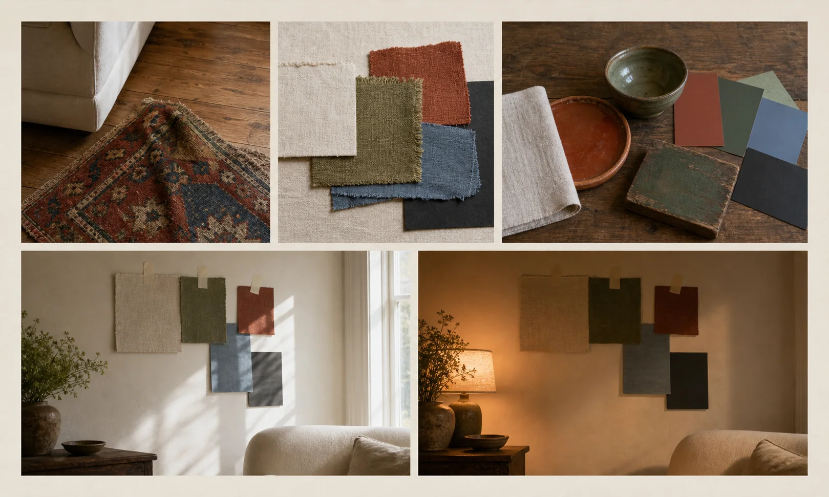
- 01Choose the source
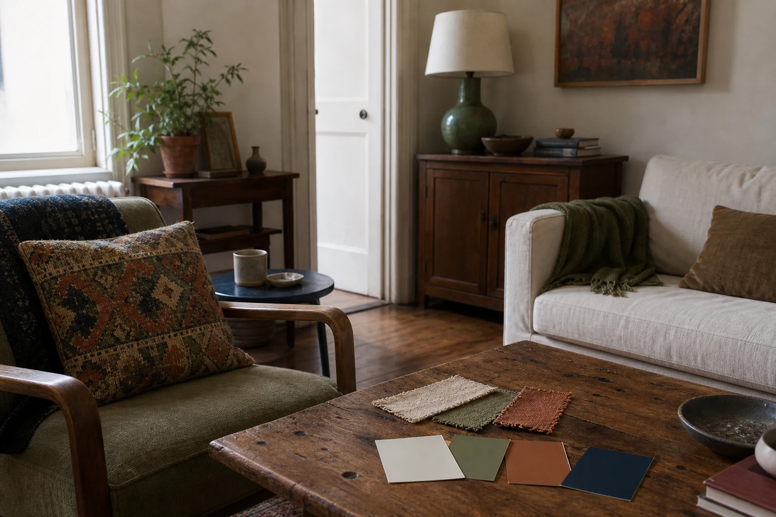
- 02Pull fabric samples
- 03Translate paint + materials
- 04Test in daylight
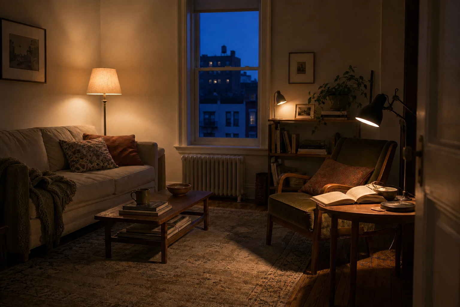
- 05Test under lamplight
The source item should contain several colours you would genuinely enjoy seeing every day. It should also relate to the room in scale or meaning.
Strong palette sources
- a rug with a field colour, pattern colours and a dark outline;
- a painting or print that will remain in the room;
- a curtain, quilt or substantial textile;
- a patterned chair or headboard fabric;
- a ceramic or object with several glazes;
- a view outside, translated thoughtfully rather than copied literally;
- a material combination already fixed in the room, such as tile, timber and stone.
A tiny accessory can inspire an accent but may not contain enough visual information for an entire room. If the only loved object is a blue vase, pair it with the room’s wood, floor and a favourite neutral textile to create a fuller source group.
Choose meaning over trend. A textile connected to family, travel or a maker you value can hold the room together for longer than a fashionable palette downloaded without context. If an object is culturally specific, identify and display it respectfully rather than treating it as a generic colour prop.
2. Read the colours by job—not by how many you can find
Place the source item in the room and view it from several steps away. Which colour creates the overall field? Which one appears second? What is the deepest outline? Which small note makes the object memorable?
Write five plain-language descriptions before collecting paint cards:
- warm chalk;
- smoky moss;
- faded rust;
- dusty blue;
- soft ink.
Descriptive language keeps you focused on character rather than an exact digital code. The “faded rust” in linen, wool, paint and glazed pottery will not be identical—and that variation is often what makes the room feel layered.
Do not force every colour into the room
A complex rug might contain twelve colours. Select three to five that support the feeling you want. Leave some colours inside the source item only; they can create richness without demanding matching accessories.
If the source is bright, look for its quieter background or weathered versions of the saturated tones. If the source is neutral, include texture and a meaningful dark so the room does not become a flat collection of similar beige surfaces.
3. Treat the room’s fixed finishes as part of the palette
Flooring, stone, tile, large cabinetry, window frames and immovable furniture already contribute colour. Ignoring them does not make them disappear.
Photograph the source item beside each fixed finish. Ask:
- Does the floor read warm, cool, red, golden, grey or almost black?
- Does the stone contain a vein that connects to the source?
- Is the existing sofa a base colour or a large supporting tone?
- Do metal frames and hardware function as the anchor dark?
- Does the view outside introduce a strong seasonal colour?
You do not have to repeat an unattractive fixed colour everywhere. Instead, create a bridge. A yellow-toned floor can feel calmer beside warm off-white, muted green and rust than beside a stark blue-white wall. A cool grey tile may connect to dusty blue, charcoal and warmer timber.
If two fixed finishes strongly disagree, use an intermediate textile containing both colour families. A rug, curtain or artwork can make the contrast look considered without hiding either surface.
4. Find colour connections without demanding an exact match
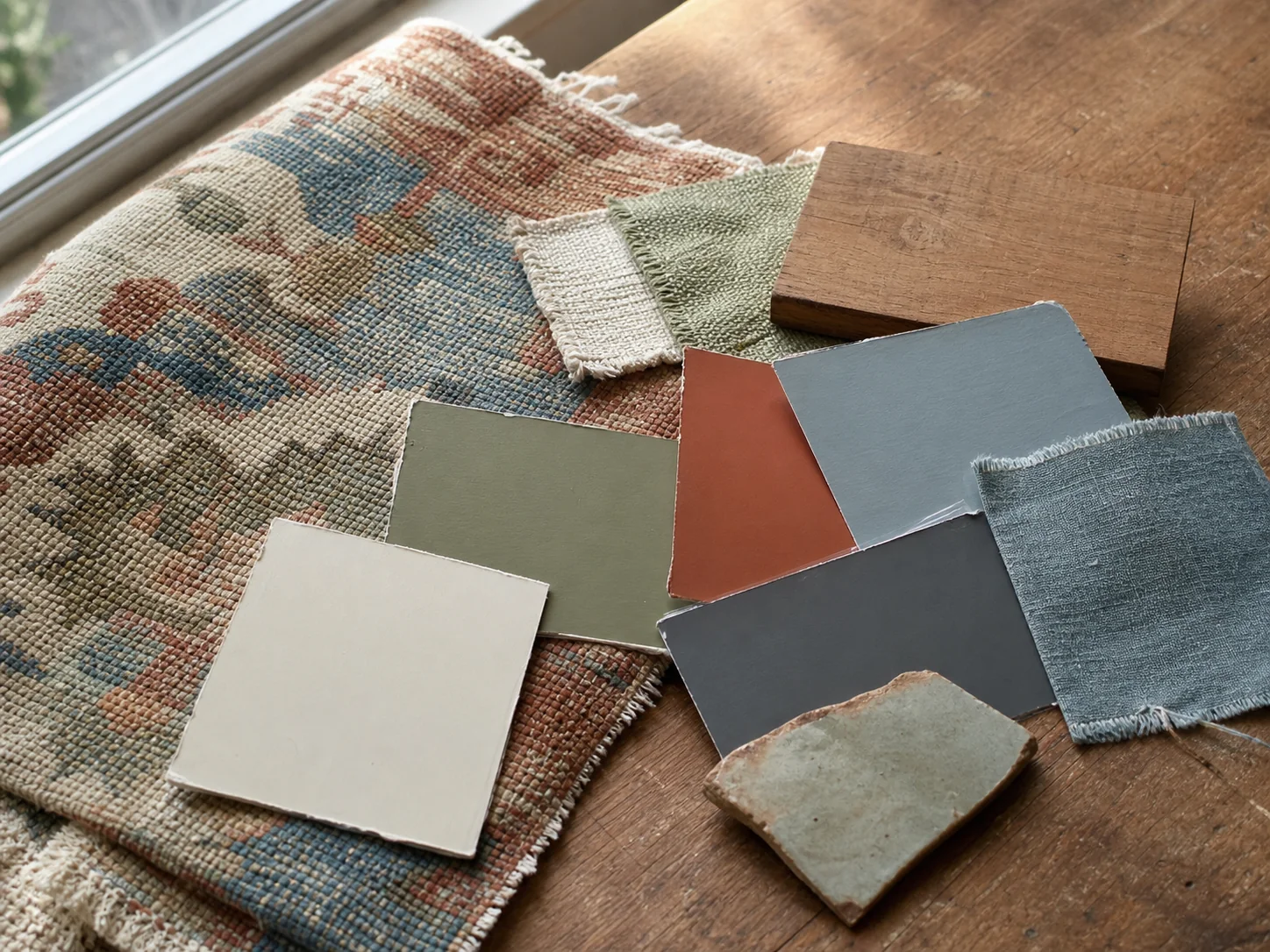
Undertone is the quieter colour that affects how a neutral or muted shade relates to its neighbours. A white may lean yellow, pink, grey or green. A brown may lean red, orange or ashy. These shifts become more visible when samples sit side by side.
Use comparison rather than trying to diagnose a colour in isolation:
- Place two or three similar samples beside the source item.
- Remove the one that looks noticeably too pink, yellow, blue or grey.
- Compare the survivors beside the floor and main upholstery.
- View them vertically on the wall, not only flat on a table.
- Repeat the comparison at night under the lamps you actually use.
Warm and cool colours can mix beautifully. The aim is not to place the room on one side of a temperature chart; it is to make the transitions believable. A cool blue can sharpen warm timber. A warm rust can stop blue-grey walls feeling distant. Repeat each side of the contrast so neither looks accidental.
Digital colour pickers are useful for capturing ideas, but screens, cameras and online swatches do not reproduce paint or textiles reliably. Final decisions need physical samples in the room.
5. Set a flexible hierarchy of base, support and accent
Colour jobs
Hierarchy makes a palette feel like a room.
Use flexible relationships rather than a rigid formula.
- BaseLargest quiet fieldWalls, rug, upholstery, or broad wood tone.
- SupportRepeated middle noteCurtains, furniture, and larger textiles.
- AccentSmallest vivid noteArt, cushions, books, and objects.
The familiar 60/30/10 colour rule suggests a dominant colour, a supporting colour and a smaller accent. It can help when every shade is competing, but it is not a scientific requirement and does not need to be measured.
Think in visual area instead:
- Base: enough quiet colour for the room to breathe.
- Support: one or two tones that appear across medium-sized pieces.
- Accent: a small, repeated note that gives the eye a route.
- Anchor dark: limited depth that keeps pale palettes from floating.
A room with deep walls may use the dark colour as its base and cream as the supporting contrast. A neutral rental may keep walls as the base while colour appears in a large rug, chair, curtains and art. The hierarchy matters more than which tone is lightest.
Repeat the accent two or three times at different heights. A little rust in the rug, artwork and cushion feels intentional. Twenty rust accessories turn an accent into a theme.
6. Translate colours across materials and textures
A palette looks more natural when the same colour family changes with the material. Moss green can appear as matte paint, velvet, a plant and a glazed ceramic. Each reflects light differently, so the repetition feels related rather than copied.
Use texture to separate similar colours
- pair smooth painted walls with woven curtains in a nearby tone;
- place a matte ceramic against polished metal;
- use wood grain as a warm neutral rather than trying to match it with brown paint;
- combine one patterned textile with several solid textures;
- repeat a dark colour in narrow lines—frames, legs and handles—rather than one heavy block.
Metal finishes also carry colour. Brass may support ochre, rust and warm wood; chrome can connect cool blue, glass and charcoal. Mixed metals can work when one is dominant and the others recur deliberately.
For a room containing furniture from several periods, use the connector method in our guide to mixing interior styles. Colour is one connector; shape, line and material can do the rest.
7. Test the palette in the light you actually live with
Lived-light test
A sample is not approved until it survives the day.
Move physical samples through the room instead of trusting one photograph.
- MorningCool / clearCheck undertones near the window.
- MiddayBrightestWatch glare and washed colour.
- EveningLamp lightSee the room when you use it most.
Colour is perception, not a fixed sticker on an object. Daylight direction, weather, surrounding surfaces and electric light all change what you see.
The U.S. Department of Energy explains that the colour appearance of white light is commonly described by correlated colour temperature (CCT), while colour fidelity describes how the light affects the appearance of objects. Two lamps can be equally “warm” yet render reds, skin tones or textiles differently.
Do the three-time test
- Morning: view samples where direct and indirect daylight first enter.
- Afternoon: check the brightest and shadowed walls.
- Evening: turn on only the lamps normally used and compare the source item, samples and fixed finishes.
Move large paint cards to different walls. A colour can look balanced on the bright wall and unexpectedly heavy in the dark corner. Place fabric vertically and horizontally because upholstery and curtains receive light differently.
Before replacing bulbs, check their base, wattage, enclosure and dimmer compatibility. Where possible, keep lamps used together reasonably consistent in colour appearance. A single blue-white lamp beside several warm lamps can divide the palette into unrelated zones.
8. Five object-led palette examples
A faded floral textile
- Base: warm cream from the ground cloth
- Support: dusty rose and leaf green
- Accent: small marigold detail
- Anchor: deep brown stems or frame
Use cream on large surfaces, green in a chair or curtain, rose in textiles and marigold only in two small places. Dark timber can repeat the stems.
A blue-and-white ceramic bowl
- Base: soft chalk or existing neutral wall
- Support: inky blue and natural timber
- Accent: a small warm red or ochre from nearby art
- Anchor: black or very dark blue lines
The warm accent prevents the blue-and-white scheme becoming cold. Repeat blue in one substantial textile rather than many nautical accessories.
A vintage rug in rust, navy and sand
- Base: sand or warm plaster
- Support: faded rust and medium wood
- Accent: navy
- Anchor: the rug’s deepest outline
Let the rug remain the most patterned element. Use rust in one chair or throw, navy in art and a lamp, and keep other large textiles quieter.
A landscape painting
- Base: the sky’s muted grey or warm cloud colour
- Support: moss and earth
- Accent: a limited sunset or flower colour
- Anchor: tree line or frame
Avoid turning the room into a literal landscape theme. Translate colour into materials: moss velvet, earth-toned timber and a small copper or coral accent.
A favourite ochre chair
- Base: warm off-white or muted stone
- Support: deep teal or forest green
- Accent: ochre, already supplied by the chair
- Anchor: dark wood or blackened metal
Do not add ochre cushions to every seat. Let the chair remain special and connect it with one small artwork detail or book spine.
9. Build colour without paint—and keep the room usable
For renters: use the existing wall colour as the base, even if it was not your first choice. Add one large textile, curtains installed with approved hardware, removable covers, art and lampshades. Check the lease before painting or attaching anything. Keep original fittings if reinstatement is required.
For a limited budget: rearrange the colours already in the home. Move books by visual weight rather than rainbow order, swap cushion covers between rooms, frame a meaningful textile, paint only an approved small piece with suitable leftover paint, or let plants supply green where conditions allow.
For low vision or cognitive access: beauty and clarity can work together. Strong contrast can help distinguish a door, handle, stair edge or important control, while glare and dense high-contrast pattern can make some spaces harder to interpret. Individual needs differ. Do not camouflage a level change or essential fitting for the sake of a seamless palette; seek qualified access guidance where needed.
For older paint and renovation: do not sand, scrape or disturb an unknown coating casually. Older buildings may contain hazardous materials. Follow local guidance and use appropriately qualified help for assessment and preparation.
10. Apply the palette in an order that prevents expensive mistakes
- Keep the source item visible. It is the reference, not an accessory to add later.
- Record fixed finishes. Floor, stone, large furniture and metalwork already count.
- Test the layout and light. Colour cannot repair a blocked route or one harsh ceiling fixture.
- Choose the largest flexible surface. This may be paint, a rug, curtain or sofa cover; sample it in the room.
- Add one supporting mid-size element. A chair, bedding or curtain gives the palette enough visual area to be understood.
- Repeat the connector. Echo colour through art, a lamp, books or an object you own.
- Add the accent last. Stop after two or three clear repetitions.
Do not buy a set of small accessories first. They can consume the budget without changing the room’s visual field. Layout, lighting and one correctly scaled textile usually have more impact.
Try the full no-buy home reset before deciding the palette needs new furniture or storage.
The 45-minute one-item palette plan
- Minutes 0–5: place the source item in the room and photograph it with the floor and largest furniture.
- Minutes 5–10: write five plain-language colour descriptions.
- Minutes 10–15: choose one base, two supporting tones, one accent and one anchor dark.
- Minutes 15–25: gather existing textiles, books, art and objects that belong to those colour families.
- Minutes 25–35: distribute the base, support and accent at different heights; remove unrelated small decor temporarily.
- Minutes 35–40: move one lamp and check the palette under evening light.
- Minutes 40–45: photograph the result and write only the gaps that remain.
Live with the edit for several days. The goal is not to complete the room in 45 minutes; it is to create enough evidence for the next decision.
The whole-room colour-palette checklist
- The source item is meaningful and will remain in the room.
- The palette includes the floor, large furniture and other fixed finishes.
- One colour provides enough quiet visual area.
- One or two supporting colours appear in medium-sized elements.
- The accent appears only two or three times.
- A dark or contrasting note gives pale colours an anchor.
- Important colours vary through texture and material rather than exact matching.
- Physical samples have been viewed on more than one wall.
- The palette works in morning, afternoon and evening light.
- Bulbs used together have been checked for compatible colour appearance.
- Routes, level changes and essential controls remain visually clear.
- Paint, textiles and fittings follow product, rental and local safety guidance.
Frequently asked questions
What is the 60/30/10 colour rule?
It is a flexible decorating prompt: roughly 60 percent dominant colour, 30 percent supporting colour and 10 percent accent. It is not a requirement. Use it to create hierarchy, not to count objects or force an accent into every corner.
How many colours should a room have?
Three to five clearly related roles are easy to manage, but materials contain many natural variations. A room may include more colours inside art or pattern without repeating every one elsewhere.
Do all neutrals need the same undertone?
No. Warm and cool neutrals can create useful contrast. Compare them beside the fixed finishes and repeat each important family so the difference looks intentional.
Can wood count as a colour?
Yes. Timber contributes hue, value, grain and visual weight. Treat warm oak, red-toned wood, pale ash or dark walnut as real parts of the palette rather than invisible neutrals.
Should the wall colour come from the lightest part of the rug?
It can, but it does not have to. The quiet rug field is often a useful base. Deep walls can also work when the room has sufficient light, contrast and a clear hierarchy. Test large physical samples before deciding.
Why does my paint look different after sunset?
Electric light has its own colour appearance and colour-rendering characteristics. Surrounding surfaces also reflect colour onto the wall. Test the sample under the lamps and brightness levels you use at night.
How do I use a very colourful artwork without making the room busy?
Choose the artwork’s quietest field colour as the base, repeat one or two mid-tones and let the remaining bright colours stay inside the art. Give it plain wall space and restrained nearby textiles.
Can I create a palette without buying paint samples?
Begin with textiles, books, objects and existing paint cards you own. For a final paint decision, a current physical sample is far more reliable than a screen. Follow local disposal guidance for leftover sample paint.
Let the source item lead without making it match everything
A loved object gives the room a point of view. Its field colour can create calm, its supporting tones can connect unlike furniture and its smallest note can supply the surprise. The object does not need a ring of matching accessories to prove its importance.
Work from large relationships to small details, compare physical materials and wait for the evening light. A palette built this way feels coherent because it grew from something real—not because every colour was copied exactly.
About the visuals in this guide
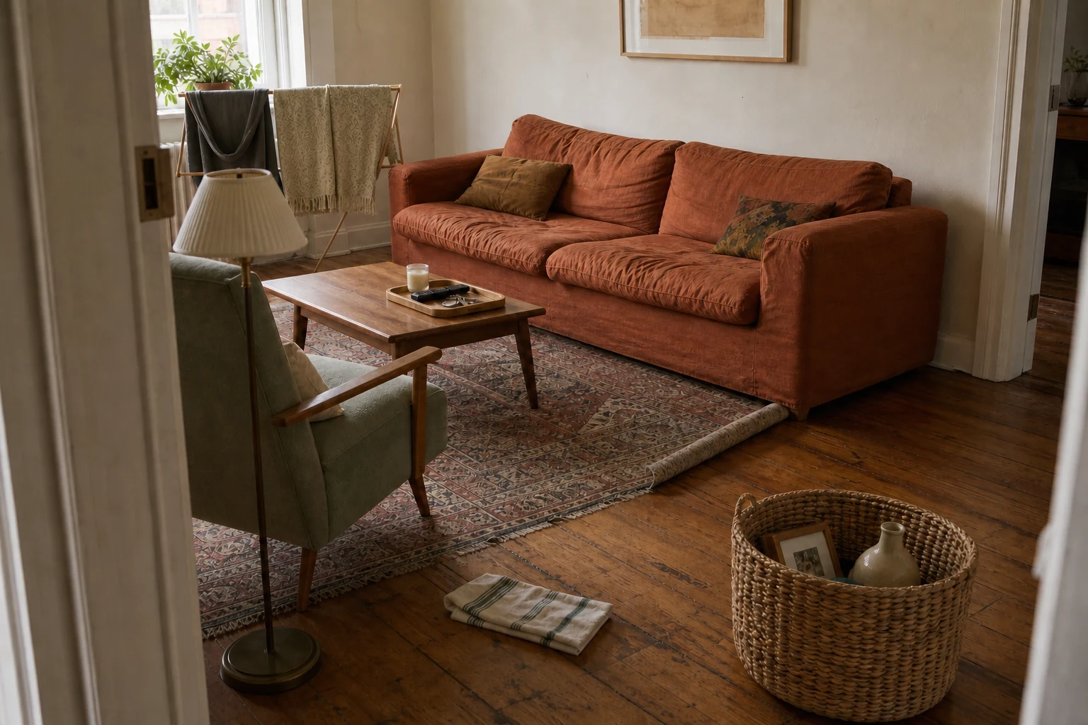
These are original Dealsmaster editorial illustrations produced with AI assistance for explanation and inspiration. They do not document a real household, tested installation, reader result, or professional inspection.
Sources and further reading
- Smithsonian Institution: Smithsonian Color Journey
- Smithsonian Institution and Cooper Hewitt: Saturated—The Allure and Science of Color
- U.S. Department of Energy: LED Basics—colour appearance and colour fidelity
- ENERGY STAR: Light fixture colour appearance guidance
- Cooper Hewitt, Smithsonian Design Museum: Josef Frank and colour in Swedish modern design
- U.S. Environmental Protection Agency: Renovation, Repair and Painting Program
Editorial note: Paint, lighting, renovation and accessibility requirements differ by product, property and jurisdiction. Follow current labels, lease conditions and local hazard guidance.