The most personal rooms rarely belong to one interior style. They contain the sensible sofa bought for a first flat, a table inherited from family, a lamp discovered second-hand and a textile chosen simply because its colour felt right. The problem is not that these pieces are different. The problem begins when nothing in the room explains why they belong together.
You do not need to replace your belongings with a coordinated collection. You need a clear hierarchy, a few repeated visual connections and enough quiet space for the interesting pieces to be noticed. When those foundations are in place, contrast feels deliberate rather than random.
This guide gives you a practical method for mixing interior styles with what you already own. It works whether your taste combines Scandinavian and Bohemian, Mid-Century and traditional, industrial and romantic, or several influences that do not have convenient labels at all.
How to mix interior styles: the quick summary
| Decision | What goes wrong | A better move |
|---|---|---|
| Overall direction | Every piece tries to establish a different mood | Write one sentence describing how the room should feel and function |
| Main influence | Several styles compete at equal volume | Let the architecture or largest pieces provide a quiet foundation |
| Colour | Each new object introduces an unrelated colour | Repeat a small palette in different strengths and materials |
| Materials | Wood tones and metals appear once and look accidental | Repeat important finishes at least twice, without making them identical |
| Scale | One delicate piece is overwhelmed by several heavy ones | Distribute visual weight across the room and protect clear space |
| Decor | Small objects become a catalogue of unrelated motifs | Group meaningful pieces and leave deliberate areas of rest |
1. Write a room brief before naming any styles
Style labels are useful shorthand, but they are poor instructions on their own. “Boho living room” does not tell you whether the room must handle children, work calls, film nights, a mobility aid or a cat that treats open shelving as a climbing wall.
Begin with one sentence that combines feeling and function. For example:
- “A warm, collected living room with comfortable conversation seating and concealed toy storage.”
- “A calm bedroom with traditional character, easy-to-reach storage and no fragile objects in the walking route.”
- “A bright rental dining area that feels creative but can return to a clear work surface in five minutes.”
Choose three feeling words, but make them specific enough to guide a decision. “Beautiful” and “stylish” are too broad. “Grounded, playful, uncluttered” tells you more. When an object is attractive but makes the room feel formal, glossy or busy, the brief helps you recognise the mismatch.
If you are not yet sure which styles you like, start with the visual vocabulary in our guide to five enduring interior styles. Borrow principles rather than trying to reproduce a complete look.
2. Choose the room’s visual anchor
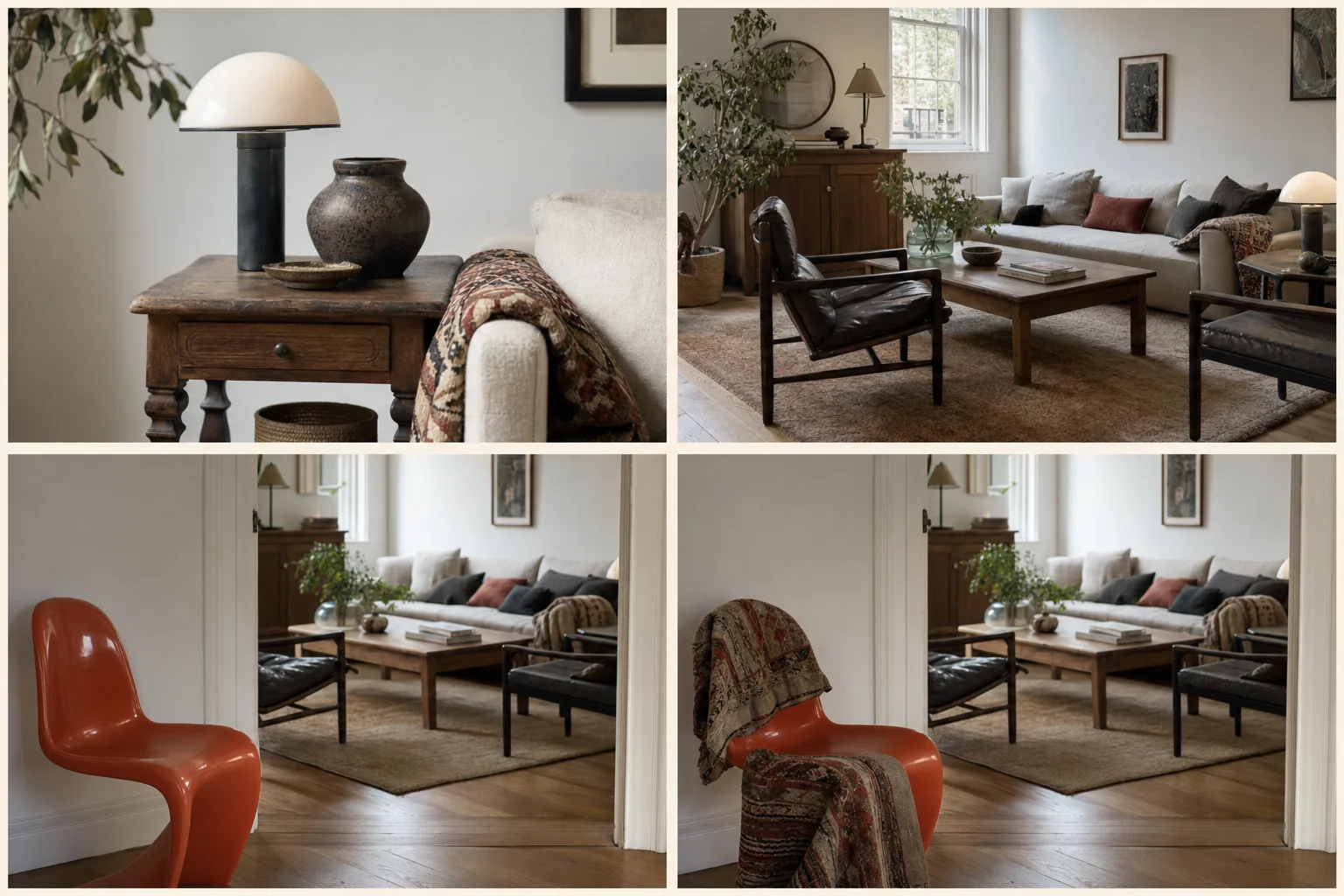
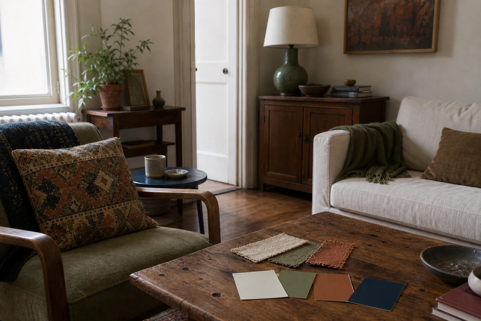
- 01Name the anchors
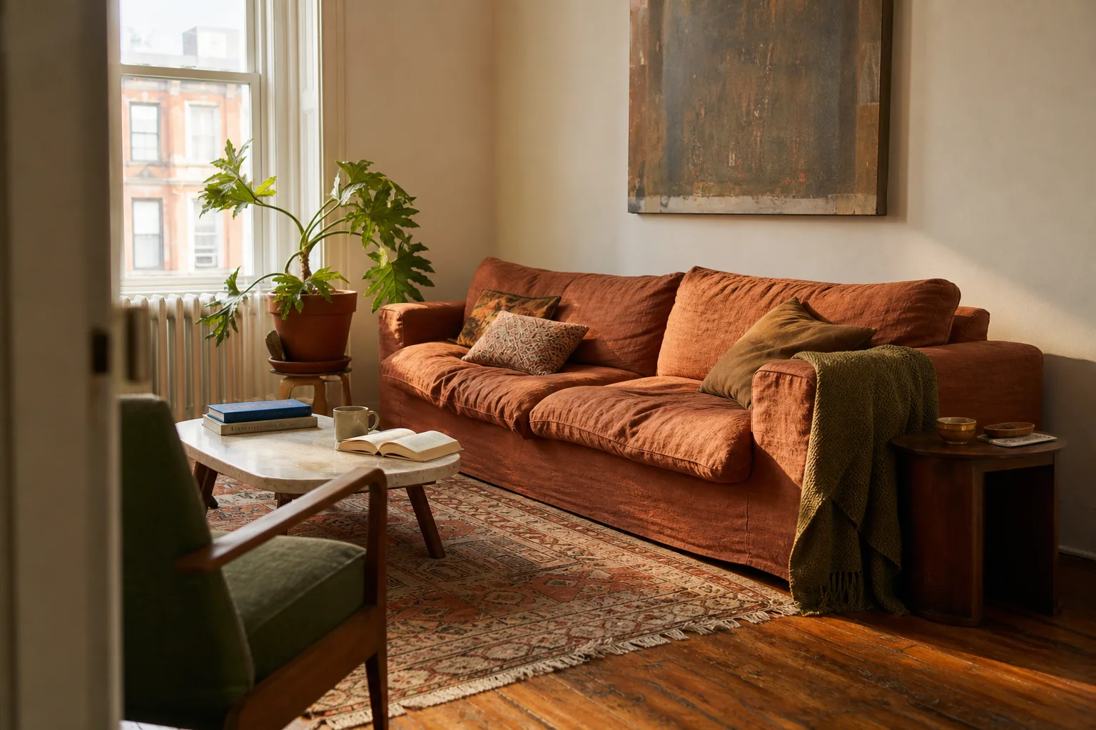
- 02See the whole room
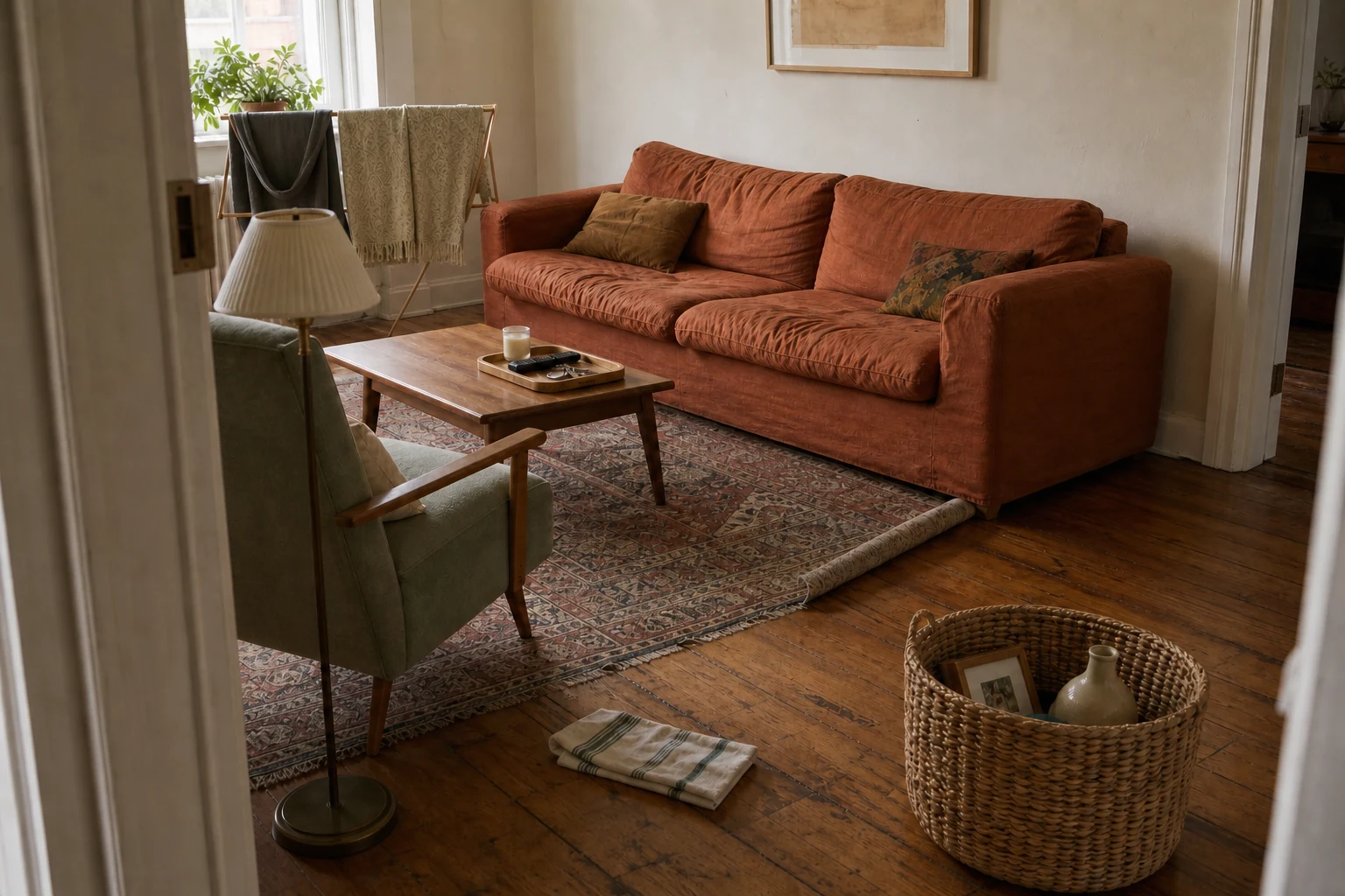
- 03Isolated contrast
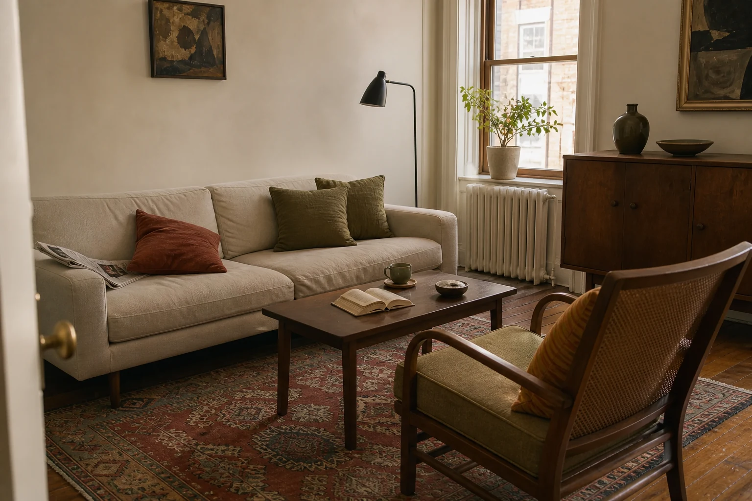
- 04Contrast with a bridge
The anchor is the element that sets the room’s broad direction. It may be the architecture, the largest piece of furniture or the item you are least willing to replace. In a living room, that is often the sofa, rug, fireplace or wall colour. In a dining room, it might be the table. In a bedroom, it may be the bed, wardrobe or a loved textile.
Do not assume the anchor must be the most exciting object. A quiet sofa can provide the calm field that allows an ornate cabinet and expressive artwork to coexist. A simple wall colour can make furniture from three periods feel connected.
Audit what already has visual authority
- Stand in each doorway and note the first three things you notice.
- Identify the fixed features: flooring, windows, doors, built-ins and major finishes.
- Circle the large pieces that must stay for budget, comfort or sentimental reasons.
- Choose which of those elements should lead and which should become quieter.
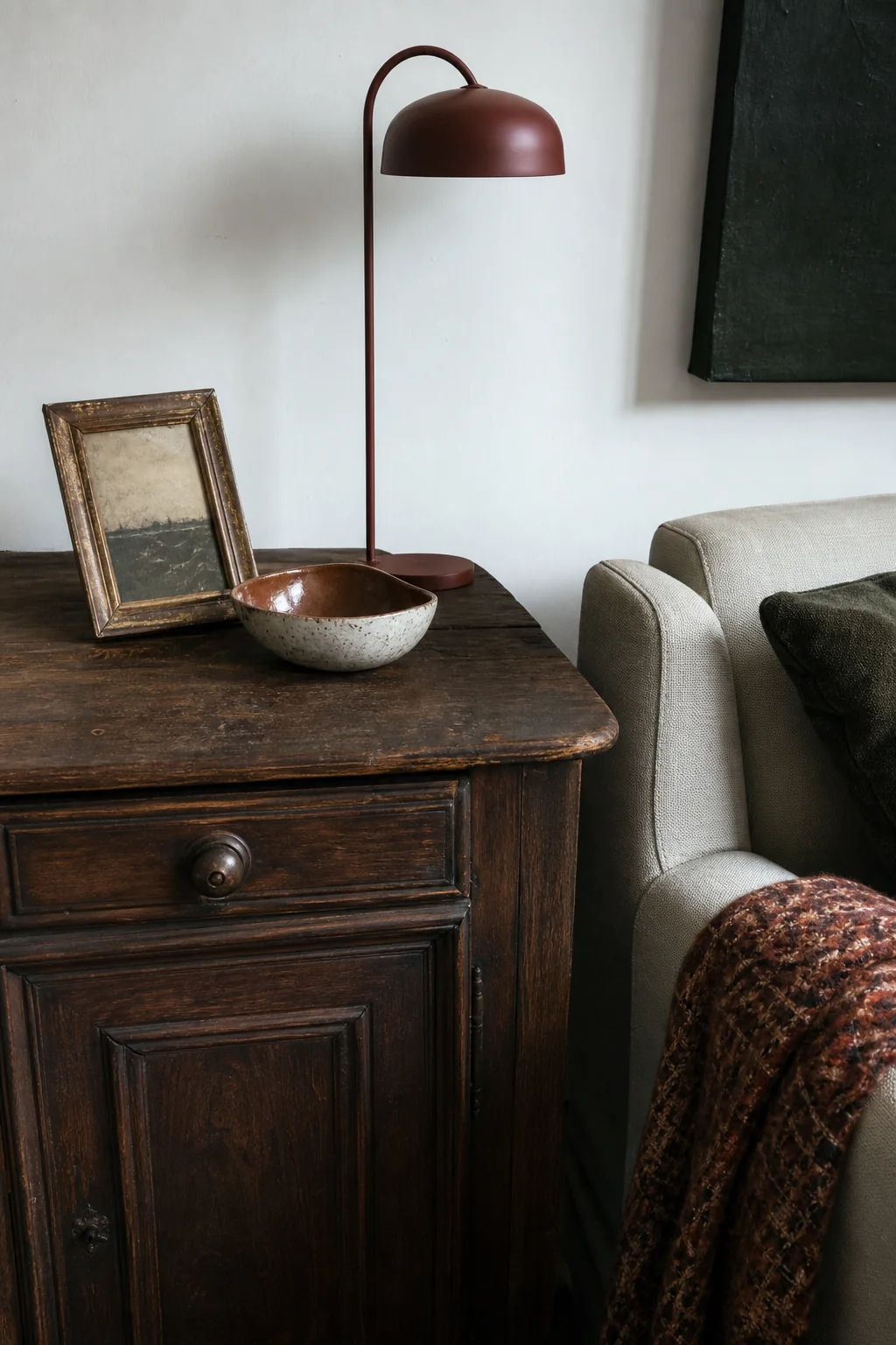
A dark traditional cabinet can lead without forcing every other item to become traditional. Repeat its warmth in a picture frame, lamp base or stripe in the rug, then let the seating remain cleaner and more contemporary.
3. Give each style influence a role
Mixed rooms become confusing when every influence tries to provide the furniture, colour, pattern, lighting and decoration. Instead, assign jobs.
Your main influence can shape the layout and largest forms. A supporting influence might supply material warmth or pattern. A contrasting influence can appear in one or two memorable pieces. Some designers describe this as a 70/20/10 balance; treat those numbers as a reminder to create hierarchy, not a shopping formula.
For example, a room might use:
- Scandinavian as the foundation: clear layout, pale walls and practical storage;
- Bohemian as the supporting voice: one patterned rug, plants and handmade ceramics;
- Industrial as the accent: a dark task lamp and slim metal side table.
The room now contains three influences, but each contributes something different. There is no need for a third sofa, a collection of factory signs or a new set of “boho” accessories to prove the point.
Homes with inherited or culturally meaningful furniture need not demote those pieces to accents. A family cabinet can be the anchor while newer furniture provides comfort and practical storage around it. Hierarchy is about visual clarity, not deciding which history matters most.
4. Repeat two or three visual connectors
A connector is a quality that appears in unlike pieces and helps the eye move between them. It can be a colour, material, line, shape, finish or level of visual detail.
Useful connectors include
- Colour: rust in a vintage rug, a contemporary cushion and a small artwork.
- Wood undertone: several warm woods, even when their species and age differ.
- Metal finish: blackened metal repeated in a lamp, frame and furniture leg.
- Shape: rounded chair backs echoed by an oval table and curved lamp.
- Line: slim vertical details repeated in shelving, curtains and lighting.
- Texture: woven fibre appearing in a shade, basket and chair seat.
Two repetitions are usually enough to make a finish look intentional. Three can create a strong rhythm. Do not repeat everything equally; a room where every leg, handle and frame matches can lose the very character you wanted from mixing styles.
Wood does not need to match exactly. First notice whether the important tones feel warm, cool, red, golden, grey or very dark. A medium warm oak table can sit beside a deeper walnut cabinet when each tone appears somewhere else and the contrast looks deliberate. If one orange-toned item feels stranded, connect it with a woven shade, tan leather detail or warm frame rather than staining the entire room.
If colour is the strongest connector, build the whole-room palette from one loved item before buying more accessories. It will show which tones need visual area and which can remain inside the source object.
5. Balance scale, shape and visual weight
Role, not ratio
Give each influence a job in the room.
The strongest influence creates the field; the others support or interrupt it.
- FoundationRoom-wideMain shapes, major colour, repeated material.
- SupportSeveral echoesTextiles, lighting, and smaller furniture.
- SurpriseOne clear noteContrast that feels chosen.
A mixed room can share a palette and still feel wrong because its physical weights are uneven. A heavy skirted sofa, solid cabinet and thick coffee table can make one delicate chair look temporary. Five spindly pieces beside one monumental wardrobe can make the wardrobe feel even larger.
Visual weight comes from more than size. Dark colour, solid bases, thick arms, dense pattern and glossy contrast can make an object appear heavier. Raised legs, open frames, pale colour and visible floor make it appear lighter.
Use the doorway test
Step out of the room and return. Does all the weight collect on one wall? Does one tall item feel isolated? Does the darkest object pull your attention away from everything else? You can often rebalance the view without buying:
- move a dark lamp or frame to the opposite side;
- raise a curtain line to balance a tall cabinet;
- give a delicate chair a substantial cushion or nearby table;
- clear objects from the heaviest surface;
- leave more floor visible around the bulkiest piece.
Protect the walking route before chasing symmetry. In a compact room, the most balanced arrangement is the one that still lets people enter, sit, reach a light and move between doors without a sideways shuffle. Our small living room layout guide explains how to test circulation and furniture footprints in both metric and imperial measurements.
6. Control colour and pattern without draining the personality
Neutralising every difference is not the answer. A room can contain teal, rust, ochre and rose and still feel coherent when those colours come from one source and recur with different levels of intensity.
Choose one of these approaches:
- One dominant family: several greens, supported by warm neutrals and a small red accent.
- A three-colour palette: one quiet base, one recurring mid-tone and one limited accent.
- An object-led palette: extract colours from a rug, artwork, textile or ceramic you already love.
Pattern needs hierarchy too. Combine different scales rather than several motifs of equal size. A large botanical, narrow stripe and tiny geometric can coexist more easily than three busy medium-scale patterns. Give the strongest pattern enough plain material around it.
Check the room at night. Different lamps can shift how colours appear, and a palette that feels balanced in daylight may separate into yellow and blue zones after dark. Move existing lamps and compare the room before deciding the paint or textile is wrong.
7. Mix old and new without turning the room into a theme
Age is one of the most effective forms of contrast. New upholstery can make an old timber table feel more characterful; a contemporary lamp can keep a traditional cabinet from looking like a period display.
Start by respecting what the older piece actually is. Clean and repair it appropriately, but do not automatically paint valuable timber, remove original hardware or describe an object as antique without evidence. If an item may have historic, cultural or financial significance, seek informed advice before altering it.
Then look for a relationship rather than a replica. A curved vintage chair might connect to a modern round table through shape. An ornate mirror can sit over a simple console because the console gives it space. A rustic table can work with slim contemporary chairs when the palette and proportions agree.
Avoid costume decorating
One industrial task light can add useful edge. Ten imitation factory objects create a theme. One floral vintage textile can make a modern bed feel personal. Matching floral lamps, boxes, signs and handles may flatten the story into a set.
Choose objects for their function, material, maker or real meaning—not merely because a retailer assigned them the same style word.
8. Four mixed-style combinations that feel natural
Connector matrix
Unlike pieces can agree in four visible ways.
One strong connector may be enough; two usually make the relationship unmistakable.
- LineCurved / angularRepeat a silhouette.
- MaterialWood / metal / fibreEcho a finish.
- ColourQuiet recurrenceBridge across distance.
- EraSimilar proportionShare scale, not a date.
Scandinavian foundation + collected colour
Keep the layout open and the large furniture simple. Add a patterned vintage or responsibly sourced rug, art with a strong personal connection, several ceramics and one deeper wall or textile colour. Closed storage preserves practical calm while the visible objects carry the story.
Traditional architecture + contemporary furniture
Let mouldings, doors or a fireplace provide ornament. Use clean-lined seating that does not compete with every architectural detail. Repeat one traditional note—a warm wood, pleated shade or framed textile—so the new pieces do not look as though they are waiting for removal.
Mid-Century shapes + soft romantic detail
Use the raised legs and efficient scale of Mid-Century-influenced furniture, then soften the straight lines with a full-length curtain, faded floral, rounded lamp and warm wall colour. Keep the florals limited and allow the furniture silhouettes to remain visible.
Industrial contrast + natural craft
Choose one honest hard material—dark metal, brick or concrete—and balance it with timber, fabric, clay and woven fibre. A workshop-inspired shelf can hold books and handmade pottery without needing faux signs or deliberately distressed accessories.
9. Do the no-buy coherence edit
Before adding anything, make the existing relationships easier to see. Set aside 45–60 minutes and work in this order:
- Clear the routes and working surfaces. Daily objects should not disguise the layout problem.
- Remove the weakest decorative layer. Take down or gather accessories that do not support the room brief.
- Group by connector. Bring warm woods, dark metals, rounded forms or repeated colours into a more visible rhythm.
- Move one item from another room. A lamp, stool, textile or artwork may supply the missing connection.
- Create one quiet area. Leave part of a wall, shelf or tabletop deliberately open.
- Photograph the room. The image will reveal isolated colours, crowded corners and uneven visual weight.
- Wait three days. Notice the actual gap before deciding it needs a purchase.
If clutter is hiding the pieces worth seeing, begin with a small, finishable organising zone rather than emptying the whole room.
If the room still feels unsettled after this edit, try the complete no-buy home reset to test layout, lighting, textiles and storage as one connected system.
10. Rental, family and accessibility notes
For renters: build the mix through movable layers: lamps, curtains installed with approved hardware, slipcovers, art, rugs where practical and freestanding furniture. Check the lease before painting, drilling or replacing fittings. Keep original fixtures safely if the agreement requires reinstatement.
For families and pets: do not place breakable “contrast pieces” where a child or pet can pull them down. Secure top-heavy furniture with an appropriate anti-tip system and follow the manufacturer’s instructions. Washable textiles, rounded routes and closed storage can carry a style just as effectively as fragile display objects.
For accessibility: style should never make an essential control hard to reach or a route difficult to use. Keep needed seating heights, transfer space, door manoeuvring room and access to switches or storage specific to the person. Low furniture is not required for a Japandi influence; delicate armless seating is not required for Mid-Century character. Borrow the palette, material or line while choosing furniture that supports the body using it.
Decorating clearances are flexible; building and accessibility requirements are not. Follow the rules that apply to the property and seek a qualified local assessment for individual access needs.
The mixed-style room checklist
- The room has a one-sentence feeling-and-function brief.
- One element provides a clear visual foundation.
- Supporting influences have specific jobs rather than equal volume.
- Two or three colours, shapes or materials repeat across unlike pieces.
- Important wood and metal tones appear more than once.
- Heavy and delicate forms are distributed rather than clustered.
- The strongest pattern has enough plain space around it.
- Older or culturally specific objects are identified and treated respectfully.
- Routes, doors, controls and everyday surfaces remain usable.
- At least one wall or surface gives the eye a place to rest.
- Every new purchase would solve a named gap rather than prove a style.
Frequently asked questions
How many interior styles can I mix in one room?
There is no fixed maximum. Two or three named influences are usually easier to manage, but a room can contain pieces from many periods when the palette, scale and materials create a clear hierarchy. Count competing visual languages, not labels.
Does the 70/20/10 rule have to be exact?
No. It is a planning prompt that reminds you to create a dominant idea, a supporting layer and a smaller contrast. Do not count objects or spend money to meet a percentage.
Can I mix different wood tones?
Yes. Start by identifying warm and cool undertones, then repeat each major tone at least twice. A rug, frame, woven object or leather detail can bridge woods that are not an exact match.
Can modern furniture work in a traditional room?
Yes. Traditional architecture often benefits from simpler furniture that allows mouldings, doors or fireplaces to remain visible. Connect new and old through one shared colour, material, curve or level of formality.
What if my partner and I like completely different styles?
Agree first on function, comfort and three feeling words. Give each person a meaningful anchor or zone, then choose a shared palette and connectors. The goal is not to split the room in half; it is to make both sets of priorities visible within one plan.
Why does my room still feel random after I matched the colours?
Check scale and visual weight. Several heavy pieces may be clustered together, or every item may have a different silhouette and level of detail. Clear one surface, redistribute dark elements and repeat a shape or material before adding more colour.
Should every room in the home use the same style?
No. Let rooms respond to their light and purpose. A repeated wall undertone, timber, metal finish or small group of colours can connect the home while each room develops its own emphasis.
A coherent room can still hold surprises
Good mixing is not about disguising every difference. It is about making the differences legible. A quiet foundation lets a strange lamp be charming. A repeated colour lets an inherited chair speak to a contemporary sofa. Clear space lets a handmade object carry more meaning than ten coordinated accessories.
Start with the room’s job, protect the pieces that matter and repeat only enough to create a rhythm. When the home feels connected to the people inside it, “matching” becomes a much less interesting goal.
About the visuals in this guide
These are original Dealsmaster editorial illustrations produced with AI assistance for explanation and inspiration. They do not document a real household, tested installation, reader result, or professional inspection.
Sources and further reading
- Cooper Hewitt, Smithsonian Design Museum: Josef Frank and Swedish modern design
- Museum of Modern Art: Charles and Ray Eames
- Designmuseum Danmark: Learning from Japan
- Smithsonian Institution: Smithsonian Color Journey
- U.S. Environmental Protection Agency: Refuse, Reduce, Reuse, Repair, Recycle
- U.S. Consumer Product Safety Commission: Anchor It! furniture and television safety